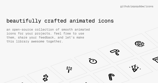
Shame they didn’t use a proper license when publishing.
Update: A license was added
Nice! And MIT too. Perfect; I’ve given it a star now.
So basically don’t use this in anything commercial because the phrase “feel free” is different to legally libre and gratis. I personally wouldn’t touch this until it’s released under a reputable license.
I wouldn’t assume this is done with malice in mind, but maybe this is someone unaware of the importance of a formal license.
They have a proper license now: https://github.com/pqoqubbw/icons/commit/0ae3fe52047e9c8fa326beb09b446e062019d03e
Kudos to the devs quick turn around.
Why are these TypeScript + JSX rather than just SVGs? It seems that the paths are defined as SVG but they are using some JavaScript framework to define the animations rather than just using SVG or CSS animations.
Because they’re using events and downloading a few megabytes of extra javascript framework is, of course, a way better option than six lines of SVG stylesheets.
Edit: forgot a /s
These should be called: Boops.
a lot of these are terrible, made by an animator who doesn’t understand design and just wants to make lines move for the heck of it.
They made me want to click each of them. So am I allowed to consider them nice, or is your “professional” opinion going to be the judgement of that?
if you have to ask me for “permission” for having your own opinions, well, i won’t stop you.
No, I am essentially asking why they suck if a common user, such as me, likes them. Seems they fulfilled their purpose?
Since you hold a strong opinion on the quality, can you give an example of an animated icon pack which keeps to good design standards?


