Has this been done somewhere?
Any other ways to make it look better than tearing it down? Whole bunch of fake glass?
Some graffiti is, I think, traditional at this point and a good mural can do wonders to humanize it. I have a feeling that patterns are not actually going to improve it though. The problem is often the form rather than what the material looks like. You could paint it to look like a row of thatched cottages but that would to me be even more depressing.
You are also then committed to repainting it regularly or it’s going to quickly look even worse than when you started.
Plants, especially vines, tend to go great with brutalism. The living contrast adds color and life to durable structures.
Vines in my opinion are great dicore maybe that’s because I’m a sucker for abandoned building vibes idk what it is that makes me love looking at abandoned buildings it’s one of the reasons I love portal 2’s abandoned sci Fi look if I wasn’t for the high heights and turrets I would love to explore abandoned apeture
Run neon tubes along every edge.
The Bierpinsel in Berlin has been painted in a few different ways, and looked great in all of them. Do an image search for it, you’ll see what I mean
It can’t quite get brutalist buildings to look as good as non-brutalist buildings, but yeah painting them is a great move that really improves the vibe.
Not sure if this counts as brutalist, but the post made me think of this example from Portland

Have a before photo?
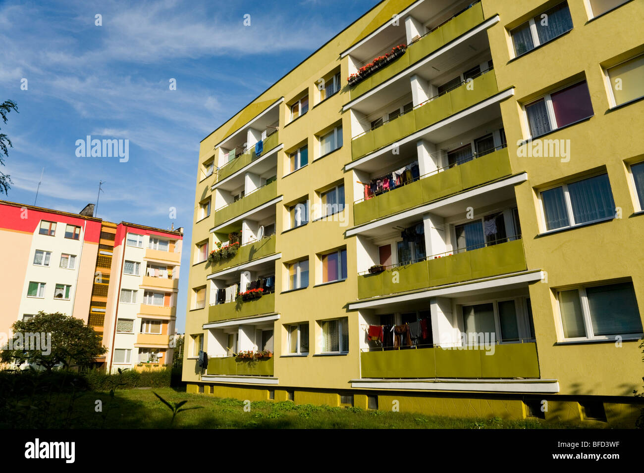
It’s been done quite a bit throughout Eastern Europe. Here are some examples from Poland:


Certainly a nicer colour scheme than dirty soul-crushing grey.
Those don’t look brutalist to me. I feel like brutalism calls for more than just grey blocks of concrete.
Not sure if you’re making a clever joke, or if you don’t know that brutalism is defined by using steel and concrete in large blocks. Might be a mega “woosh” on my part though haha
I wasn’t making a joke. It doesn’t feel right to call every unpainted concrete box brutalist.
Edit: https://mcmansionhell.com/post/187806092991/the-brutalism-post-part-2-what-brutalism-is-not/amp
Brutality architecture, done well, already looks amazing!
That said, yes, their tendency towards large unbroken planes of material make them prime candidates for murals, and you see a lot of that in places like Chicago that had a big Brutalist phase.
I feel like most brutalist buildings are designed by a committee. They want the building to look like it provided maximal value for money, so they try to avoid looking good.
Let me introduce you to Tirana, Albania which has done exactly as you suggest! They elected a former painter as mayor in 2000, and the rest is history. So many of the brutalist buildings in the city are now covered with bright colors, murals, patterns, and more. You can check out some before and after images here: https://blog.ted.com/9-views-of-tirana-albania-with-its-bright-multicolored-building/
He was asked to opt for more neutral colors. “I told them no. Compromise in colors is grey,”
Lol.
Had to look up the tedtalk https://www.youtube.com/watch?v=oDNgnrt_D8w
I should have linked that too, but yes, he’s great!!
I feel like I remember reading about a city that basically encouraged graffiti, and would rotate through local artists every few months or so. Seems like a great way to give the place some character


