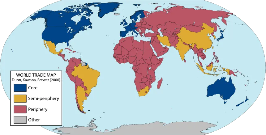
translation: There are people conjuring thoughts like “I’ve seen one too many brown people”.
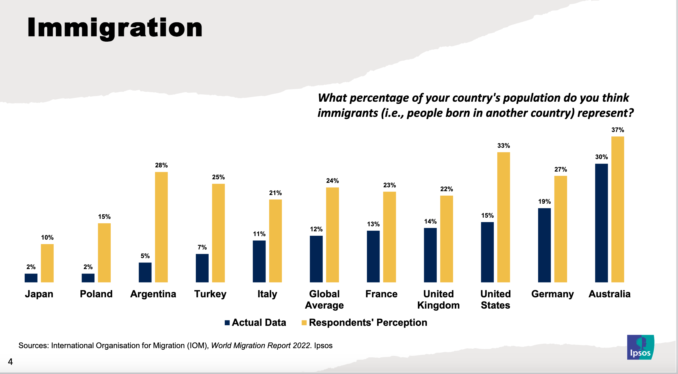
Also unsurprising where the sentiment is coming from:

srcs:
- https://www.ipsos.com/en/perils/perils-perception-prejudice-and-conspiracy-theories-0
- https://ourworldindata.org/data-insights/many-people-overestimate-the-percentage-of-immigrants-in-their-country
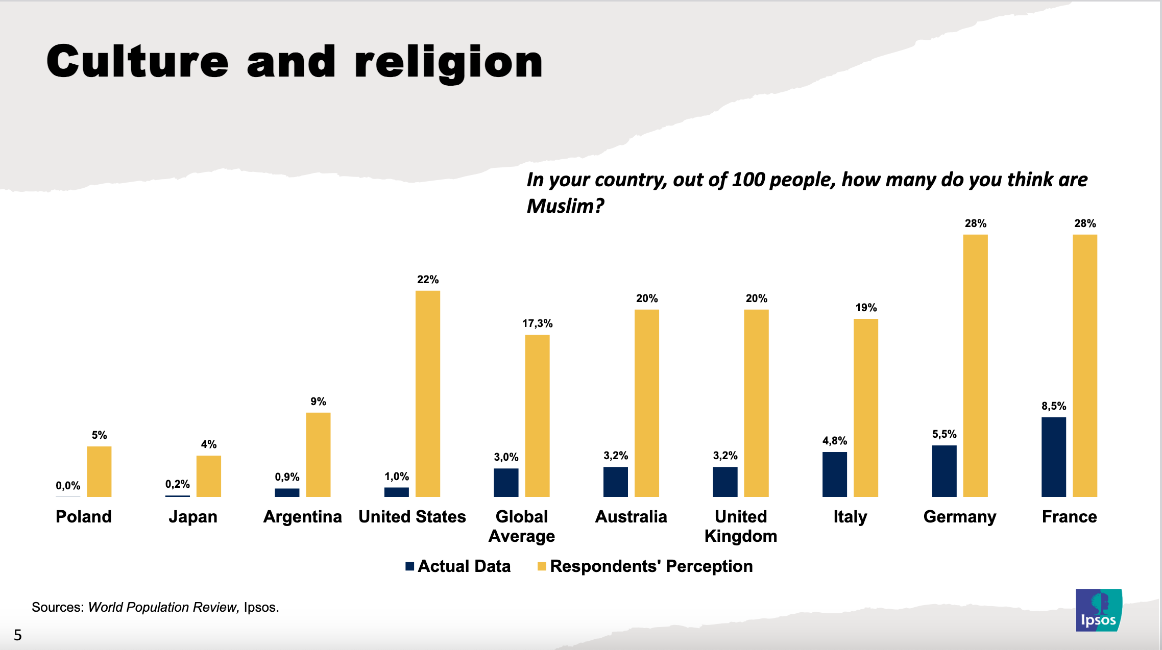
More imbecility (from the same src):


The point is also to compare which countries have a slantier line than others, I think. Which this graph is fine for. As far as whether it’s accurate, by whose standard? It’s just relative, to me a 20 percent difference is a lot.